Enviro Spase Features
Integrates with ArcMap*
Easily map your data
Customize your displays
Display supporting data
Highlight important information
Integrated with Enviro Data
Enviro Spase Benefits
Inexpensive to buy
Save time and money
Improve project quality
Easy to learn and use
Impress your clients
Best support in the industry
Easy and Efficient Analysis and Display of Environmental Data in GIS
Geotech's Enviro Spase software (pronounced like "space" for SPAtial databaSE) helps you display and analyze environmental data, such as field and laboratory data for water, as well as soil and air data. Enviro Spase runs within ESRI's ArcGIS 10.1 or newer. Enviro Spase provides a full set of tools called Wizards to make it easy to see just the data you want, just the way you want it. Enviro Spase works great with Geotech's Enviro Data management software, or can accept data from other database systems.By moving the data directly from the database to the GIS map, you will save time while improving quality. Using Enviro Spase with your data management system brings the accuracy and efficiency of organized data management to your GIS mapping.
* Enviro Spase does not currently run on ArcGIS Pro.
Enviro Spase has many useful capabilities. Here are a few:
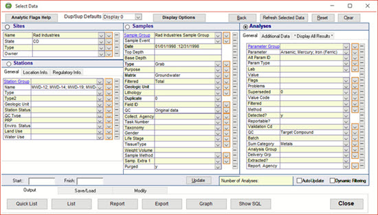
Data Selection
Selection of data can be made in Enviro Data so you can quickly select the data you wish to display and chose the options for its display. By using the Select Data form (shown here) to move the data directly from your database to the GIS map, you will save time while improving quality. Data manipulation such as converting to consistent limits, formatting, and regulatory limit comparisons are done prior to any output. With just a few mouse clicks, if your exceedences are red in your report, they will be red on the map. And it ties in with sophisticated Enviro Data features like Value and Flag display.
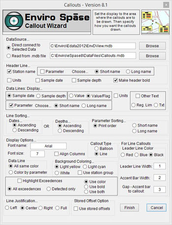
Callout Wizard Form
After the data is selected in the Enviro Data Viewer using the Select Data screen it is displayed directly on a map or saved to a file and then displayed from that file. Each result is displayed on its own line in the box. The Callout Wizard automatically displays data selected as ArcMap callouts, also known as balloons or data streamers.
This wizard is started by clicking on the Callouts icon on the Enviro Spase toolbar in ArcMap which opens a dialog box asking you how you want your data displayed. Using this form, you many options for how the data is displayed including highlighting exceedances, and display flag information.

Callout Wizard
After you have made your selections in the Callout Wizard Forms shown above, the callouts are added to the current map, and positioned based on the current view.This is done automatically in ArcGIS. The data is selected, using Enviro Data or your existing database, and then displayed directly on a map, or saved to a file and displayed from that file. The wizard lets you highlight exceedences, or color-code individual constituents. Callouts can be moved around after creation so your map looks just the way you need it.
Crosstab Callout Wizard
Like the Callout Wizard, the Crosstab Callout Wizard automatically displays your data as callouts in ArcGIS. The difference is that multiple results can be shown on each line, lined up in rows and columns. The data is selected, and then displayed directly on a map, or saved to a file and displayed from that. Multiple sample dates or depths may be displayed with multiple analytic parameter values, all in neat columns.

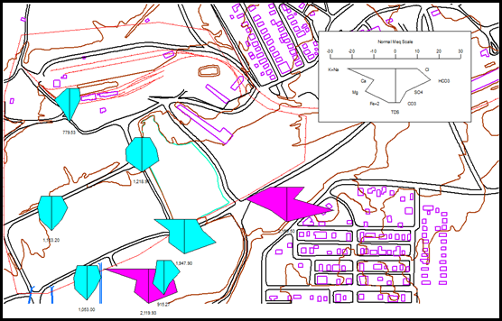
Stiff Diagram Wizard
Stiff Diagrams were invented by a hydrologist at the US Geological Survey, and described in the USGS Water Supply Paper 2254 in 1985. They are used mostly for surface and groundwater, although some people have used them for soil. Many environmental professionals are familiar with Stiff Diagrams, but in the past very few have used them due to the difficulty of preparing them. Enviro Spase makes these diagrams much more accessible by letting you draw them with just a few mouse clicks.
StickLogs with Lithology
In this significant enhancement, the original StickLog Wizard can now show lithology patterns as well as value ranges by color codes. The Wizard makes use of the many lithology patterns (symbols) that are included with ArcGIS. The four soil borings at the bottom left of this example have lithology information stored in Enviro Data. That data is used to select a symbol for display. The other stations shown do not have the lithology information and are shown as "Unknown". Value colors, lithology, or both can be displayed. Both the lithology and value legends are optional. This feature is very useful where concentrations are dependant on lithology.

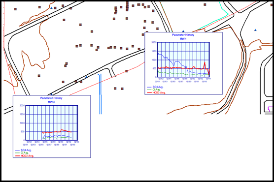
Graph Wizard
The Graph Wizard allows plotting up to twelve analytical parameter values over a time period of days, months, or years. Values are plotted on the Y-axis and dates are plotted on the X-axis. The Y-axis can have two different and independent user-defined scales so that large variations in values of different parameters can be plotted in a meaningful fashion. Each parameter graph is automatically color coded and referenced to an optional legend. The regulatory limit (if available) can be displayed as a line on the graph for one parameter.
Radar Plots
This new Wizard allows display of a single analytical parameter on multiple dates (or depths) or multiple analytical parameters on a single date or depth range. The example to the right shows sulfate graphed over a time series beginning in February 1981 and ending in May 1994. The red circle is the regulatory limit for sulfate. User-selectable options include grid color, data polygon color, data posting options, typeface, and font size. If multiple stations are plotted, the minimum and maximum values of the entire selected dataset are reported to the user who can set these to individual preferences. All plots use the same scaling so that easy comparison between plots is possible.

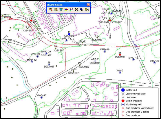
Post Station Symbols
This new Wizard lets you show station symbols using the extensive set of symbols available in ArcGIS. A pointer to the station symbol is stored in the Enviro Data Station Types table. A color and size for the symbol is also stored. Up to four station attributes can be plotted around the station. These include Station Name, Station Short Name, Datum Elevation, Ground Elevation, Station Date, Regulatory ID, Depth, and Site Number. Stations to be posted can be selected by Site Number, contents of Selected Data, or all in the database. The legend is optional and may be placed at any of the four corners of the map.
Station Name Callouts
This new Wizard posts station names in balloon or line type callouts around the periphery of the map. Station symbols and the station symbol legend can be drawn if the symbol data is included in the Enviro Data Station Types table. This uses the same process as the Post Station Symbols Wizard described above. Callouts can be shaded light cyan, light yellow, or white as shown here. Typeface, font size, and bolding are under user control. The Wizard attempts to place the callouts so that there is little or no overlap. The user can "grab" the callouts and move them anywhere on the map as desired.

Contact Us
Phone: (877) 740-1999 or (303) 740-1999
EMail: info@geotech.com
© 1995- 2023 Geotech Computer Systems, Inc.
Header photos by Dave Rich